Apple is releasing a new version of its mobile operating system this fall, bringing the company up to a nice round number: iOS 10.
Ahead of launch, Apple is allowing anyone to test the software and give their feedback. First, I would not recommend that most people download this beta. Bugs are par for the course with all early software and could try the patience of those who don’t test imperfect things for fun. Many apps behave strangely with the beta since it hasn’t gotten its final polish yet.
That’s particularly true with this system. After a week with the beta, I’m confused about where Apple is heading with this update. It’s true that this build is, by definition, not ready for primetime and it would be unfair to fully review it. But it is still basically the same software that will hit millions of devices in just a few months and is just not as good as I’ve come to expect from Apple.
There are many things I like. Apple has enhanced the Health functions to track sleep, among other new data. This system also lets you erase icons for some of the pre-installed apps (Tips, Watch, etc.) that many relegate to a permanently unused folder on their phones anyway.
Apple has also done some work on Messages, that makes it easier to send music, sketches, .gifs and photos. You can also send very large emoji. It’s sort of silly, but definitely fun.
The features are welcome changes. That can’t be said of other tweaks to the system overall, which seem to move away from the logical, simple design that make Apple stand out in the first place.
Many menus and navigation screens have gained extra panels in iOS 10, which have the effect of making each individual pane more simple, but complicate navigation overall. For example, the control center that appears when you swipe up from the bottom of the screen now has two sections — one with the Bluetooth, brightness and other familiar panel controls, plus a second just for music and volume.
These controls used to be on one screen, and there was no real reason to add a second. In fact, it took me a couple days to even realize the volume control was there at all.
These menus look a lot like the bubbly, almost empty layout you see on notifications for the Apple Watch. But sparse design makes sense on that small of a screen. While it’s understandable – even admirable – for Apple to want to unify the look of its systems across devices, it hasn’t been done in a user-focused way. That’s unusual for Apple.
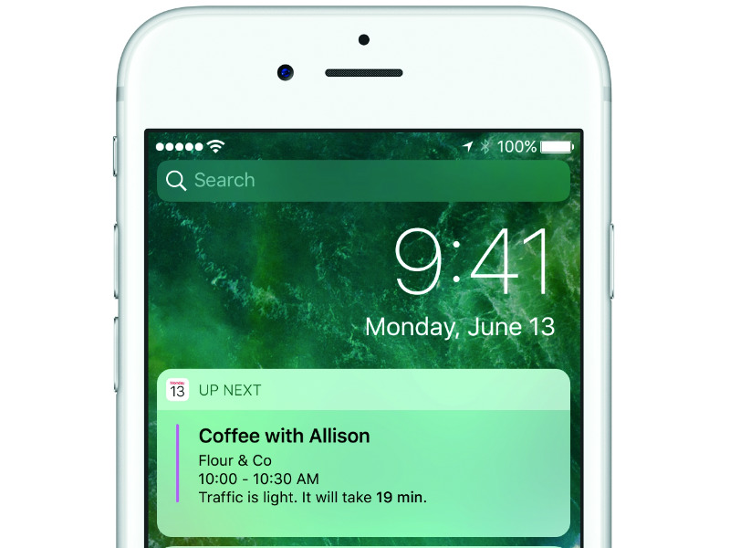
Apple has also changed the lock screen so that richer notifications can be accessed on their own screen with a simple swipe to the right, in addition to being accessible by dragging down from the top. You can also search for apps from this new section on the lock screen. That’s a win for convenience, but not for privacy. I changed the widgets that I put in my notifications screen because they felt more exposed in the new layout.
Others may want to turn off the ability to get the notification center on their lock screen altogether, through settings in the Touch ID and Passcode menu.
Many of these complaints may sound like small cosmetic gripes, and admittedly some of them are. Others, though, are more serious. And all illustrate my genuine puzzlement about why Apple is changing the feel of a system that has helped propel it to such great heights.
There’s still time for the company to squash the bugs and refine the software — something that will definitely happen. But if the rough sketch of the beta is anything to go by, users will have to prepare for changes that may confuse them once the fall comes.
[“Source-gadgets.ndtv”]
 Techosta Where Tech Starts From