 Techosta Where Tech Starts From
 The Java Zone is brought to you in partnership with JetBrains. Learn more about Kotlin, a new programming language designed by JetBrains to solve problems that software developers face every day.
In this series of posts I am covering some of the many ways you can benefit from XpoLog and especially on how to get the most valuable information about your log4j event logs.
By running Analytic Search on your log4j data, you can among other things measure your application performance and thread activity, measure code activity with class and method analytics on log4j, build various reports and analysis, and make use of various visualization gadgets for maximum analysis.
In this post I will show you XpoLog’s unique Apps, where you can create your own dashboards and visualization gadgets, to better understand what is happening inside your logs and applications.
What is an App?
An XpoLog App is like a container. It can contain any number of dashboards, and each dashboard can contain any number of gadgets. The gadgets can be a visual display, such as a graph or a chart, but it can also be textual information such as a table. From the moment a gadget is saved, the results are automatically updated at regular intervals.
XpoLog has also created unique out-of-the-box apps, some of them tailored specifically for log4j. These apps are ready for you to use, to quickly receive insights on your data, such as performance, quality, and compliance.
From Search to App (and Back)
Starting from where we left off in my last post One Small Error in Java Code, let us have a look at what our last search would look like in an App. The way to do that is to create a new gadget and place it in the relevant dashboard and App by saving the search as a gadget. I will show you how to save and view the gadgets for the log error.
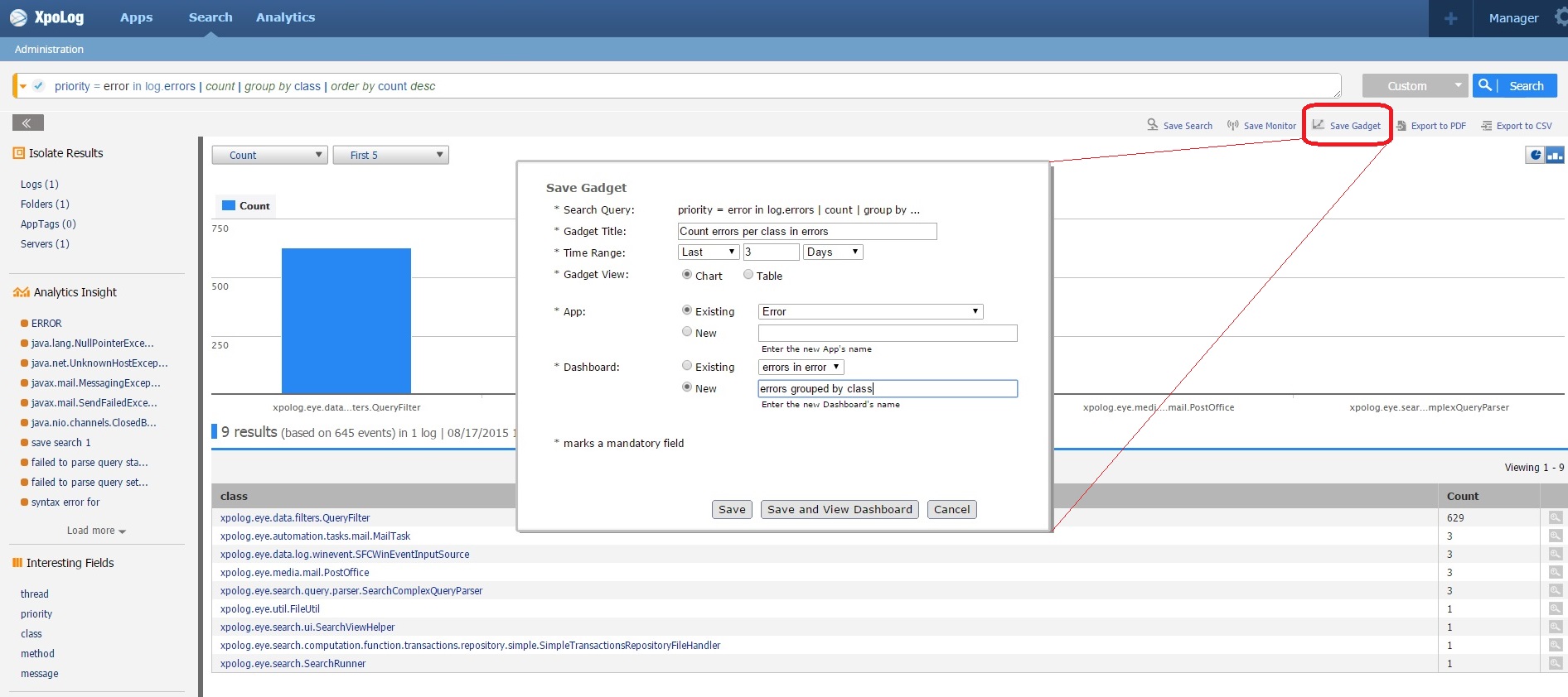
From the actual search result in the Search interface, click Save Gadget from the top right of the screen. The Save Gadget window opens.
In the Save Gadget window, give your gadget a meaningful name, select a time range, select Chart, select one of the existing apps or create a new one, and select one of the existing dashboards or create a new one. Click Save and View Dashboard.
The Apps interface opens and you can view your result:
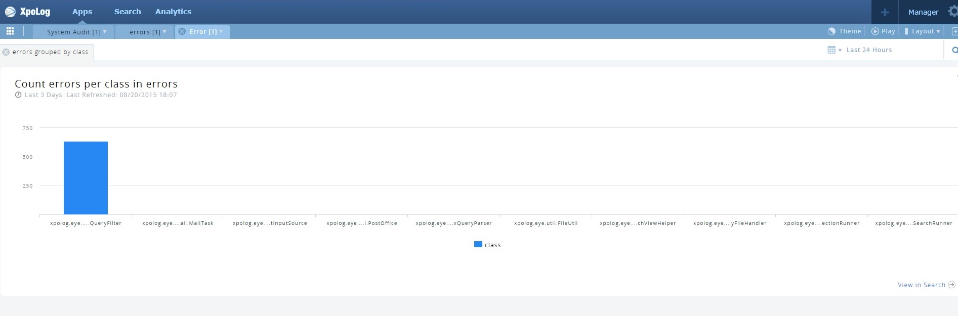
Notice the View in Search link in the bottom right corner. Clicking this link brings you (back) to theSearch interface.
You can also create your own Apps, Dashboards and Gadgets directly from the XpoLog Appsinterface. You can check out my instructions here.
Viewing Your Apps
When viewing your apps, dashboards, and gadgets, you can change the view in a number of ways, such as:
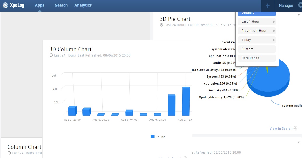
Changing the time span:
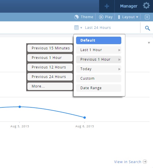
If we started by searching for errors in the last 7 days of a search but want to narrow it down to the last 24 hours, and perhaps the last hour, simply click the time-frame-icon to select a different time frame.
Here is an example of 4 Spline charts of the same search query but the time frame is narrowed down from the last 7 days to the last hour:
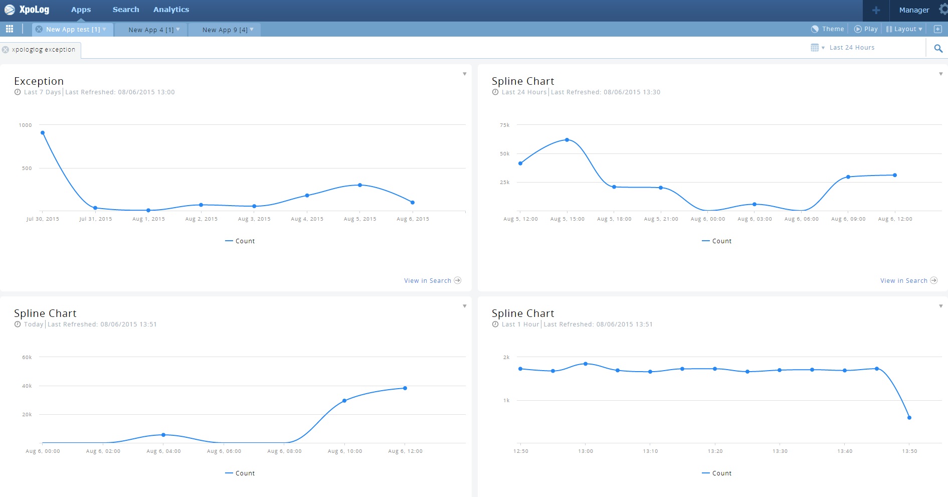
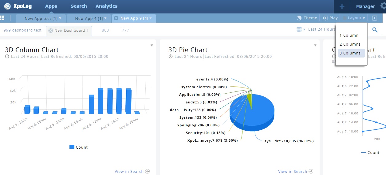
This is also a great example of many gadgets in one dashboard. Speaking of seeing several graphs (gadgets), you can chang the layout of the screen to show many gadgets simultaneously, here is an example of 3 columns of graphs/charts:
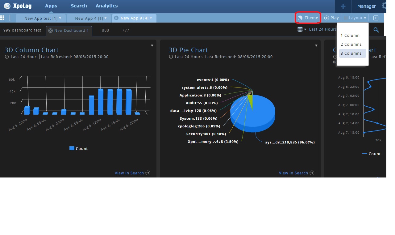
You can invert the color theme:
You can drag and drop and move them around as you please using the drag-and-drop-icon in the top left corner of each graph:
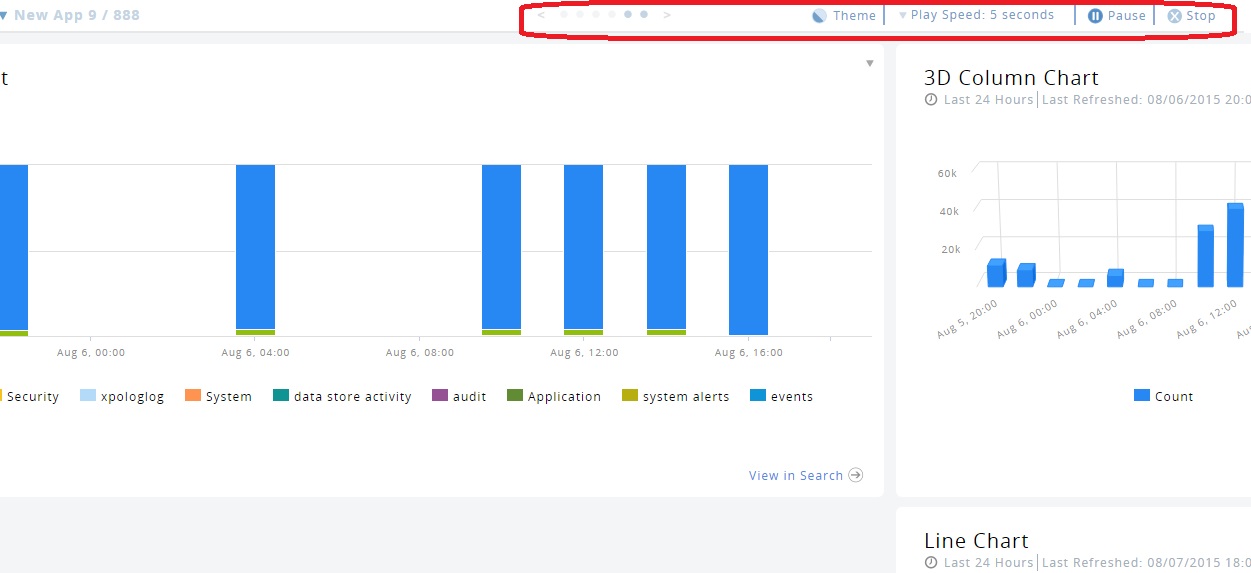
You can even create a slide-show out of all the dashboards in an App:
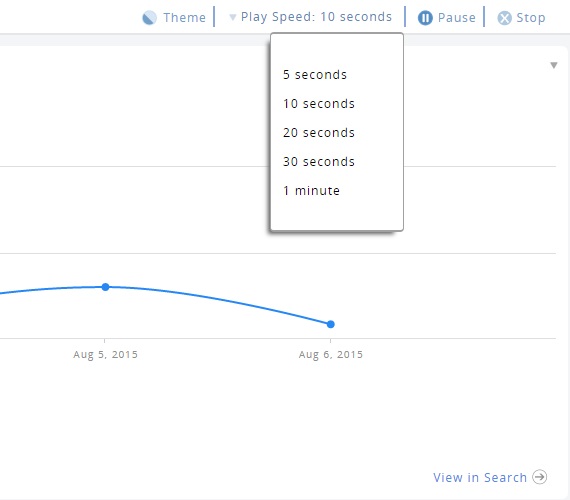
Here is a slide-show in action:
For even more ways to view your gadgets, have a look at our new features page on our site.
Other Cool App Functions
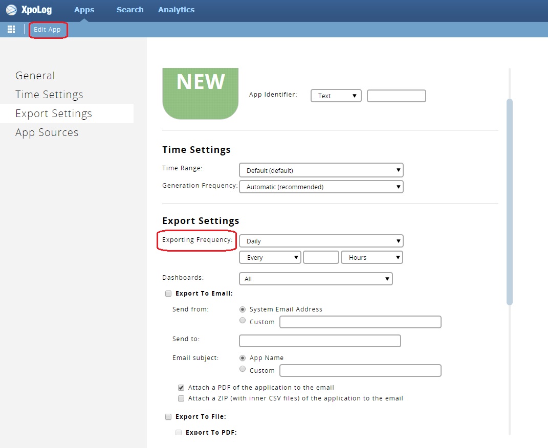
One of the useful functions of the self-created custom Apps is the Scheduled Export. Once you have created an App you like you can schedule it to send you reports as often as you wish. For example, every morning at 9 AM you want to receive a report for a specific search for the last 24 hours. The App can create reports and export them to PDF, CSV, and directly to your email.
To schedule these reports to be sent, all you need to do is click Edit App (either from the top menu bar or the side bar, depending where you are), and then, in the Export Settings section, select theExporting Frequency. From there, you can fill in all the other details needed to create the reports.
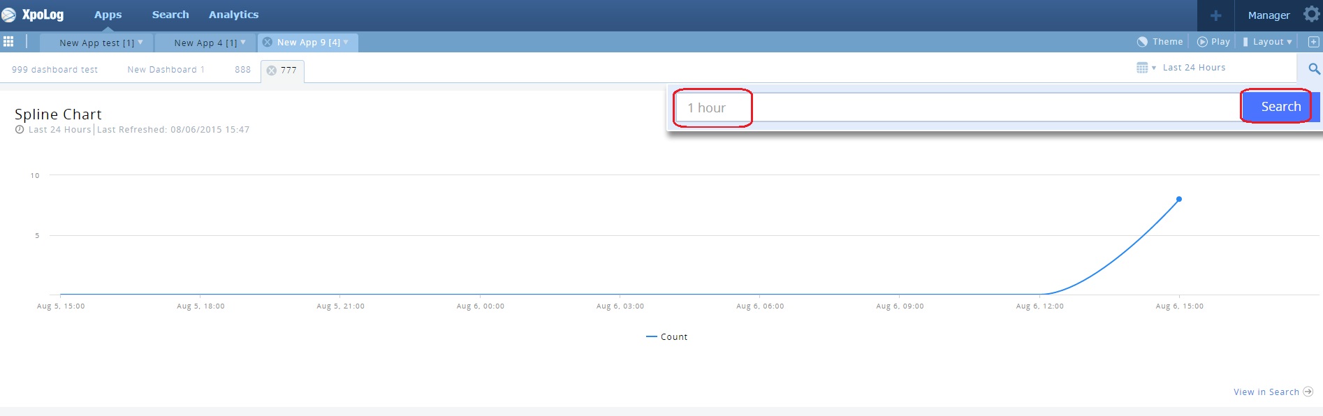
Another great App function is how you can custom filter a dashboard result to suit your needs. Let’s say you have a dashboard showing the results of a search you did, but you want to slightly alter the search without going back to the Search interface.
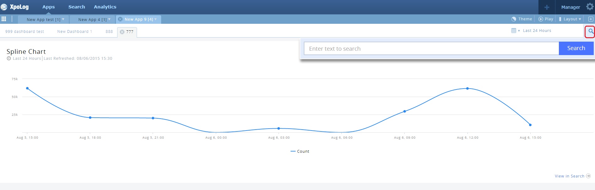
Click the search-icon and enter the change you want to make. The gadget will show the new result accordingly:
There are a number of other functions I could get into, but I suggest you check out our site for more awesome features.
Final Words
Looking back on this series of posts, I have shown you how to send your data to XpoLog, how to add logs and edit logs, how to parse them and to add AppTags to them. Then we did some Simple and Complex Searches, I introduced you briefly to Analytic Search and XpoLog Analytics. We saw how XpoLog’s Analytical Insights can find numerous anomalies you never even thought of looking for, and can give you valuable information regarding you application performance and quality of code. Last, but not least, we took a quick peek at viewing all this information in Apps.
I now suggest you have a look at and experiment with XpoLog on your own. You can download our software in just a few minutes and it’s absolutely free. If you need any help at all, configuring, navigating, or anything else, we are here to help you.
[“source-Gadgets”]